
Plotting Design Interventions as Points of System Leverage
Facilitating interdisciplinary exploration of a local health system and connecting opportunities for change
By Adam Zeiner
It’s said there’s no path, they’re made by walking.¹ Or if you possess a map, it’s not the territory.² If you don’t know where you’re going or navigating through, how daunting is that first step? And the next? And so on… taking into account even an accurate map is useless if you can’t orient yourself with it.³
Consider, like our Transitions of Care team, you aren’t the only one moving, endeavoring to guide others toward a collective north star. Partnering with local hospitalists, community clinicians, and health-system administrators, we charted the complicated hand-off process known as a transition of care, from inpatient to outpatient care, in service of supporting better health outcomes for people when they leave the hospital.
To guide alignment on a north star, our team adapted Adam Grove’s Systems Leverage Map, an inspiring framework that among other things, graphically represents a portfolio of services offered and programs administered by an organization. Our adaptation focused on a suite of potential design interventions within a singular program, as opposed to a portfolio of programs and services.
Adapting this framework enabled our interdisciplinary project team to chart and discuss the nuance, tensions, gaps, opportunities, trust-deficiencies, and enablers that come to bear in transition from a hospital stay to follow-up appointments with outpatient providers. By graphically representing potential interrelated opportunities within streams of work and the different scales at which organizational impact and effort would manifest — in the context of a person’s transition of care service experience — we assessed and aligned around where to move next; which north star to focus our collective, aspirational gaze.
Thinking and working in systems
Work aimed at system change is complex and dependent on interrelated (often conflicting) mindsets and value exchanges not always obvious or top of mind for project stakeholders and organizational leaders.
Amid our studio’s work in the domains of health, systems, and health systems, after reading Adam Groves’ proposal for progressing from service design to systems change I was (probably too) excited by how services and programs, or a portfolio of them, were situated in a systemic context. Presented as interrelated parts of a broader dynamic whole, that beget greater or lesser impact, requiring greater or lesser effort. Encouraged by this framing I set out to similarly frame the design interventions we proposed to health system leadership.
Work aimed at system change is complex and dependent on interrelated (often conflicting) mindsets and value exchanges not always obvious or top of mind for project stakeholders and organizational leaders. More often than not, there’s a significant human component to meaningful system change, necessitating a more organic and participatory approach to proposing and enacting design intervention be taken. As such, overly-engineered, mechanistic approaches to catalyzing and managing change can hinder human-action-oriented endeavors.
When engaging project partners and health system stakeholders in systemic approaches to service intervention, it’s important to illustrate how near-term efforts ladder up to intended longer-term outcomes and subsequent interventions you’re proposing. Our adapted map accomplished this by visualizing how opportunities for intervention and potential streams of work don’t exist and can’t be realized in isolation.
Below: Categories of ideas for interventions shown as work-streams that interrelate and build upon one another

Many organizations and individuals in the domains of health, healthcare, and beyond talk about long-termism but tend to act and focus on low-leverage, parameter-level, short-term efforts. To push back against this inherent short-termism and support our business case for longer-term, higher-impact, higher-effort change we sought leadership recognition of present issues and buy-in around how near-term solutions can’t address the root causes of challenges; often encompassed by the Social Determinants of Health.
(System) Leverage Points, an effective framing mechanism
To utilize our adapted map as a boundary object to convene around and facilitate cross-discipline and multi-organization conversations, we made the implicit explicit. Plotting proposed design interventions as points of system leverage, to anchor present and future efforts in a mutually established and collectively understood reality.
Leverage points, or levers for system change, proved an exquisite framing mechanism to represent the scale at which our design interventions manifest. This single, graphical representation of how we intended to catalyze change situated interventions at the stage in a person’s care journey where the impact of change would be felt, enabling us, our project partners, and stakeholders to develop a shared view of why this work is worth pursuing and funding.
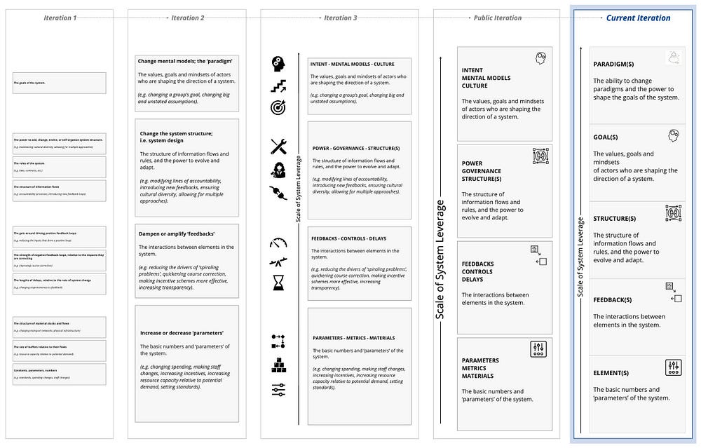
Acting on guidance from Content Lead, Lauren Gardner, we iterated on how these points of system leverage were presented in the vertical axis of our map. While Adam Groves’ original verbiage was approachable for seasoned systems thinkers, we adapted the language to accessibly introduce the notion of leverage points to those newer to systems thinking. Doing so was important because of the likelihood that beyond our core design team — folks who dance in complexity daily — a high level of systems and visual literacy, or adeptness in wrangling complexity shouldn’t be assumed.
To bring our broader project team — largely comprised of clinicians and administrators — into the conversation plainer language was adopted to convey what the four scales of system leverage encompassed. We used ‘Feedback — Controls — Delays’ in place of ‘dampen or amplify feedback(s)’. These terms were borrowed from a serendipitously timed lesson on leverage points that systems designer and project team member Natalie Privett led for the Health Systems Design course she teaches in our collaborative MA in Design focused on Health program. We’re continuing to explore ways the Y-axis of this framework can make the notion of systemic scales more accessible for our project partners.
Below: Picture of significant iterations and the current iteration of the Y axis of our map
Consider, as you adapt and iterate
Communicating complex or complicated things simply is difficult and takes time and iteration. Using 2–3 words in place of more expert-oriented wording to frame the scale of system leverage along our map’s vertical axis helped project partners and stakeholders less familiar with Systems Thinking intuitively understand what realizing opportunities for intervention positioned at each level might entail. It also afforded our project team a communally arrived at and agreed upon mental model of what the four increasingly higher-impact scales of system leverage encompass. This meant we spent more time together actively discussing our progress, potential divergences from the project plan, and aligning on our path forward.
As design and design-adjacent practitioners, we often take for granted how visually literate we are. Our adapted map remains visually dense and our project partners and stakeholders don’t likely spend their days creating and admiring graphical representations of information, maps depicting experience over time, or the abstract structures of present and potential future systems. In addition to making the vertical axis more accessible, we categorized opportunities and interventions into more digestible groupings. Each unique opportunity was tagged to relate to broader work-streams so as more information is progressively revealed, groupings and relationships remain evident. This more abstract, less dense approach also served the narrative purpose of highlighting how work-streams are sequenced to build upon one another as we progress into future project phases.
Below: Our map that shows all the individual ideas for design intervention and then our map with like ideas grouped into higher-level categories to make the artifact less dense and more approachable
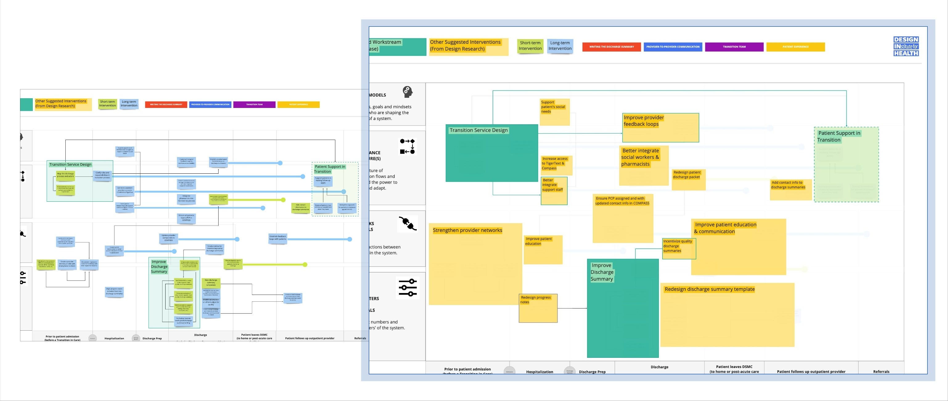
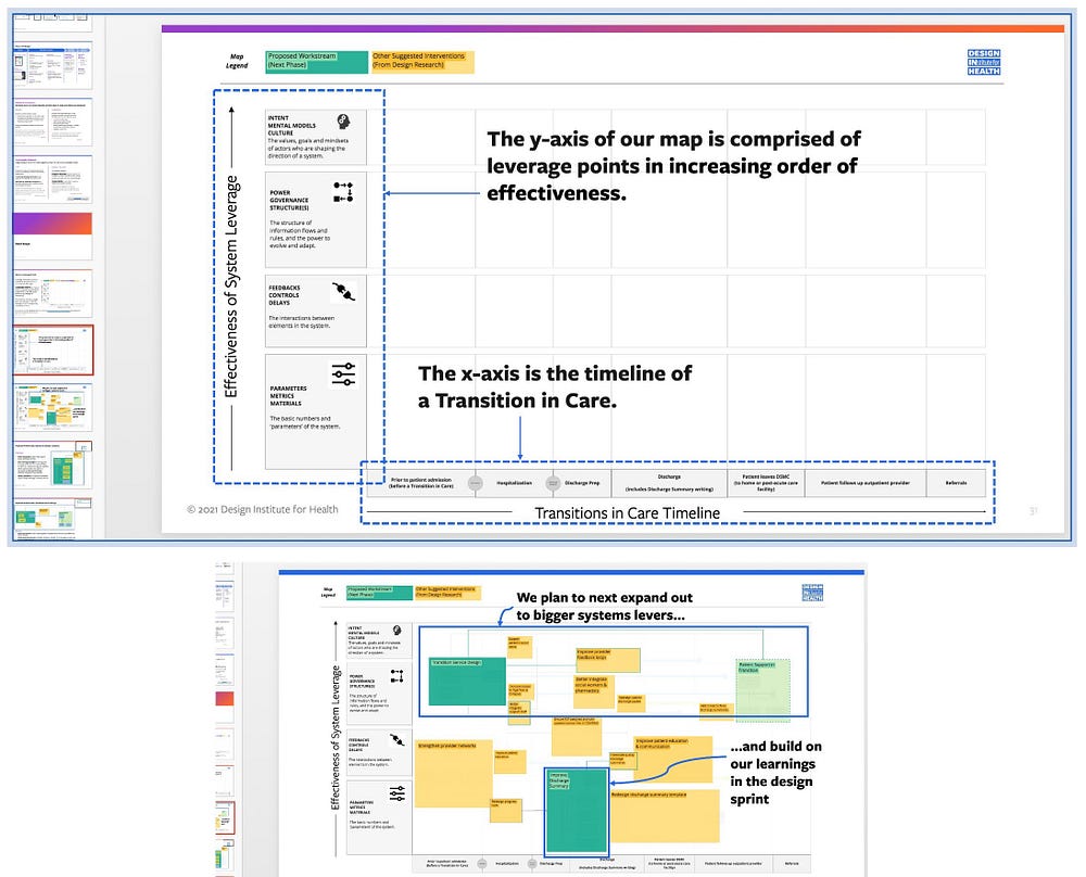
Alas, our map is still informationally dense and significant focus is required to engage with it. While being able to speak to progressively revealed, sequenced workstreams, opportunities, and interventions is useful, absent the context you provide while presenting, project partners and stakeholders may be uncertain about how to begin engaging with your map. Rendering your boundary object a speedbump in an otherwise familiar planning process. Don’t shy away from including framing verbiage into the progressive disclosure of your map, in addition to a map legend, so your presence isn’t required for others to engage.
Progressively revealing our map in a presentation deck allowed us to bring our clinical and administrative audience along for a journey through potential streams of future work and for others to engage with the map and proposed interventions without us being there to provide context.
Below: How we framed what the axes of our map can support and represent in a project-partner facing presentation deck
Hindsight, reflections, and realizations
Consensus building is a crucial aspect of co-creation. Designers often operate in the role of System Conveners (or Network Weavers if you prefer the term), and guiding people to focus on opportunities for intervention using literally the same slide and the same terms catalyzed, continued, and progressed conversations that wouldn’t have occurred otherwise. Introducing the notion of system leverage points both fostered engagement from our project team, clinical project partners, operational stakeholders, and Design Institute colleagues, and allowed the map to more effectively function as a boundary object.
Consensus building is a crucial aspect of co-creation.
Simple enough graphics with adequate framing verbiage can be employed to convene conversation around complex topics and in complicated contexts otherwise too intangible or tension-fraught to grapple with. For your design deliverables to serve in a trojan horse capacity — increasing the appetite for change within otherwise change-averse orgs and coalitions — what you produce to serve as boundary objects need not be super complex or dense. If anything, deeper information should be progressively disclosed. Mapping can be a strategic effort in and of itself and maps can serve as strategic design deliverables, particularly as a complement or supplement to more traditional planning tools and design deliverables. Producing a suite of artifacts that exist across a spectrum of information density and narrative-flare to support and build upon one another served us well to this end.
Situating future work-streams at scale while depicting how they relate to and build upon one another is paramount because systemic interventions don’t exist in isolation, often don’t unfold linearly, and their effects don’t emerge and aren’t experienced in individual, walled off silos. Adapting this map to set the stage for future phases of work while anchoring on active, present efforts was well received by project partners and stakeholders. We’re engaged in ongoing conversations around how we can continue this work at a broader organizational scale.
Iterate and adapt with me
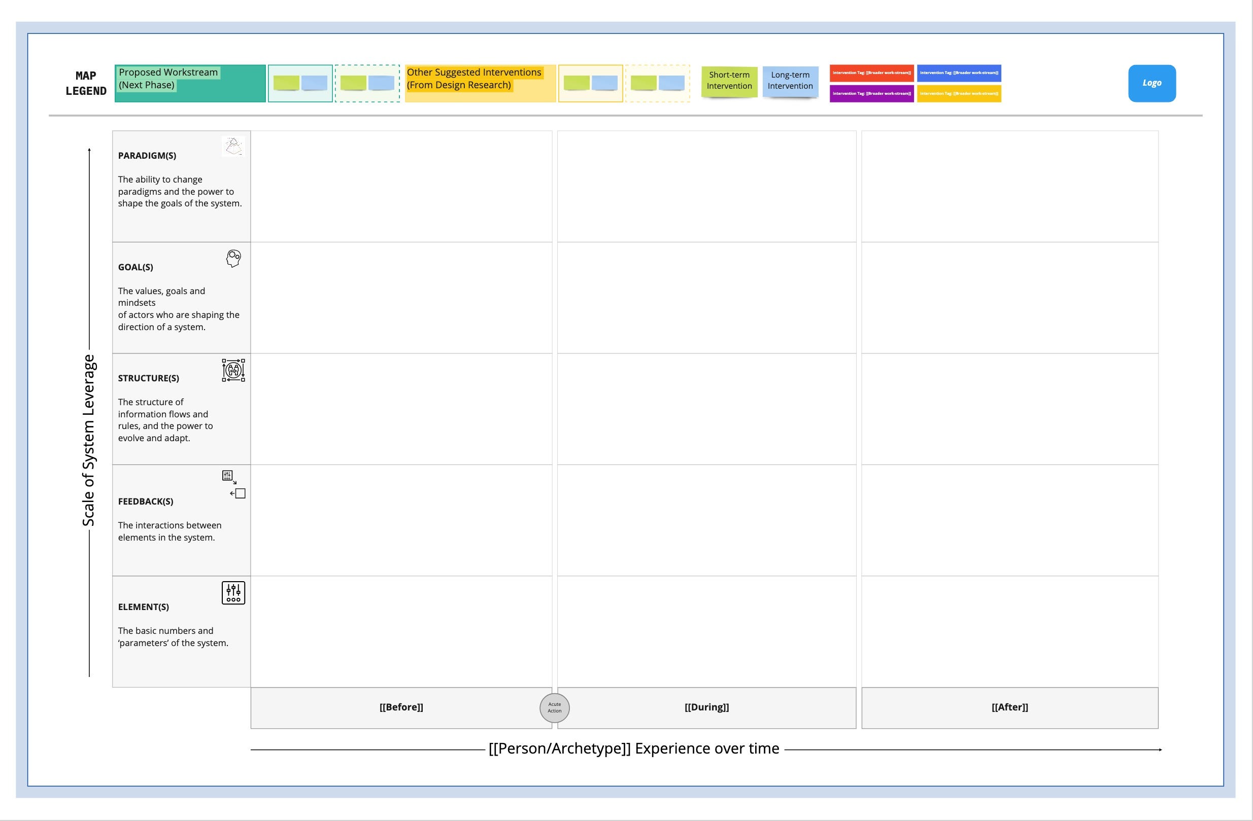
If you’d like to learn more about how we adapted this framework for the Transitions of Care project or if you’re up for discussing how you’re adapting our Miro templates, reach out via email or Twitter! I’m always eager to talk about design, systems, and systemic approaches to design. You can kick-start your system leverage mapping efforts by using our generic Miro template now listed on Miroverse.
Below: Our current System Leverage Map template (recreated in Miro) available on Miroverse
Special thanks to the core Transitions of Care project team members Lauren Gardner, Andrew Do, and Natalie Privett for feedback on my early drafts, to Taylor Cook for keeping me on track, to Kate Payne for editorial support, to Adam Groves for inspiring this article and kindly offering feedback on my early draft, and to our clinical project partners Joseph Joo, Read Pierce, and Chris Moriates for their invaluable perspective and subject matter expertise.
[1] “Traveler, There Is No Path” by Antonio Machado
[2] Map-territory relation
+ ”A map is not the territory it represents, but, if correct, it has a similar structure to the territory, which accounts for its usefulness.” — Alfred Korzybski
+ “Maps are not territories” — S.I Hayakawa
[3] “Even an accurate map can be useless to a traveler if she cannot orient herself with the map” — Laura Black
